
Enhancing ride identification, communication, and branding through customizable lighting and user-focused design.
Project summary
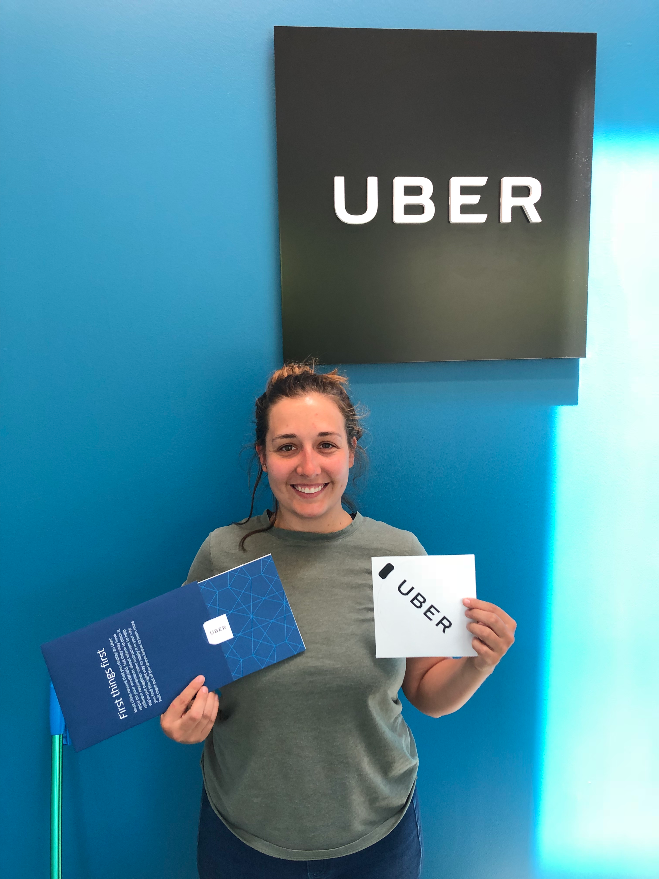
Uber approached Whipsaw with a vision to redesign the in-car beacon which was released in 2015. They needed a fresh and more iconic design that would elevate their brand experience and at the same time help with common ride-sharing problems.
Project outcome:
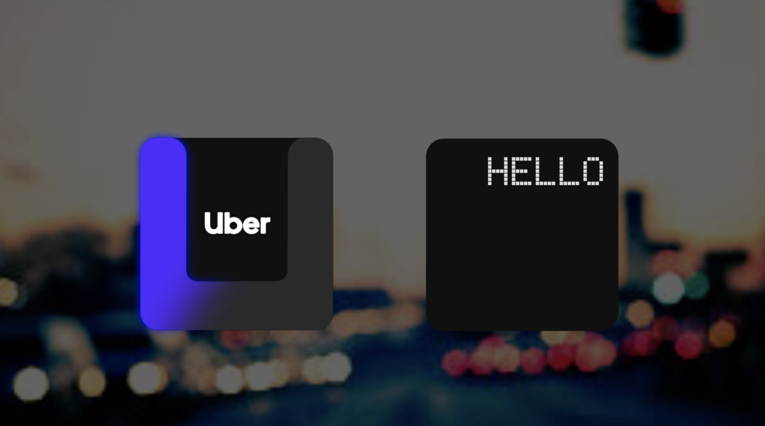
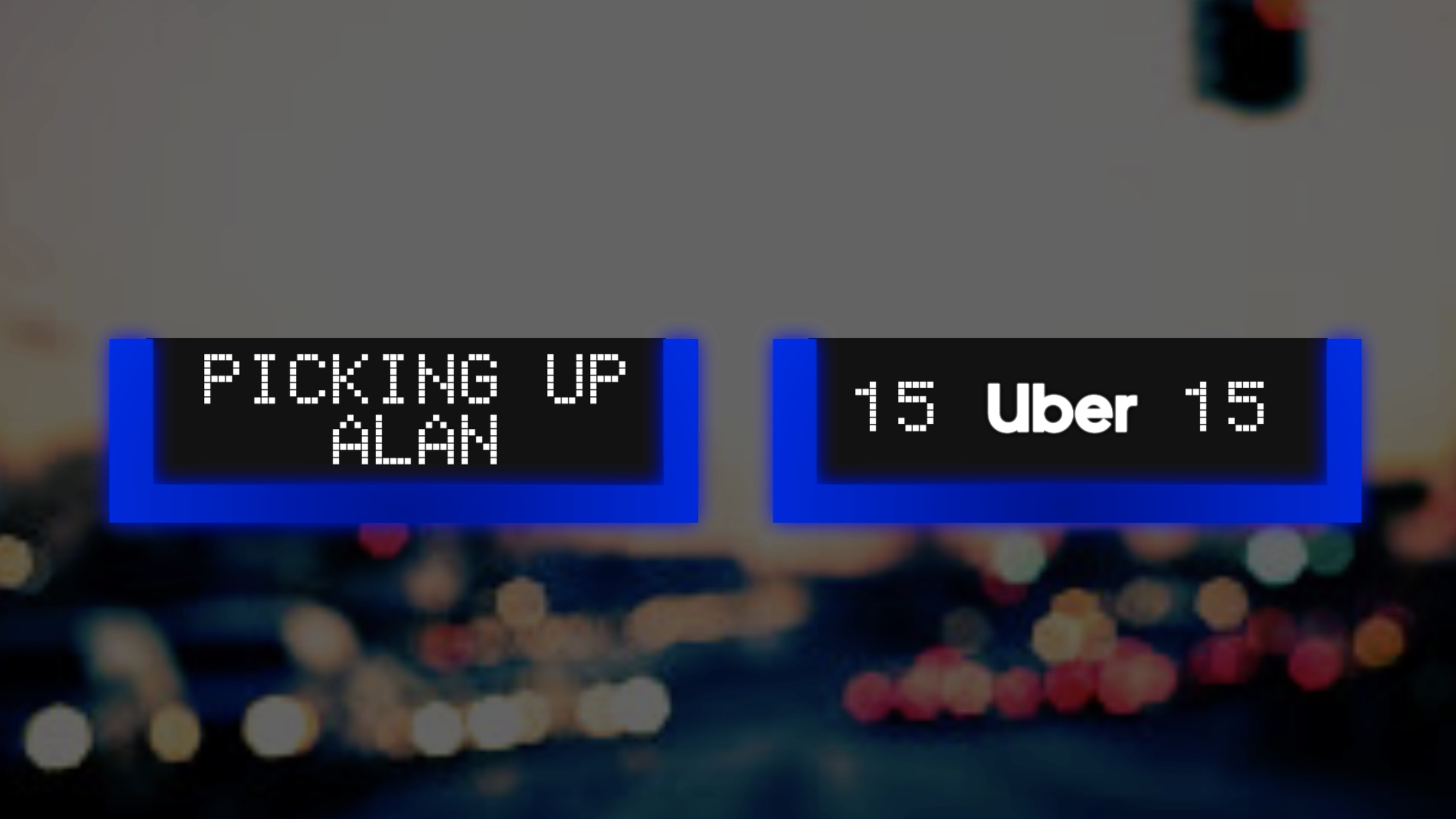
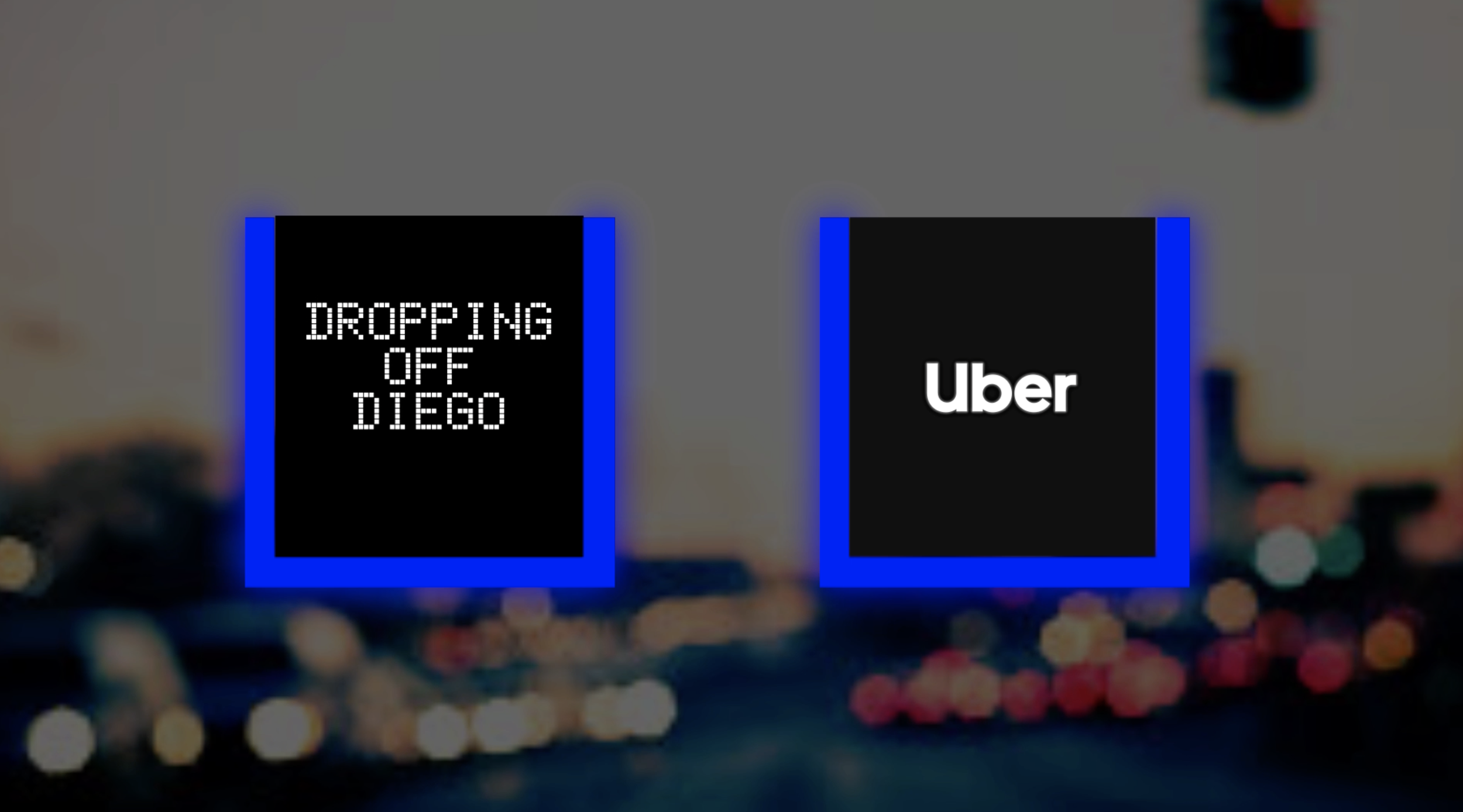
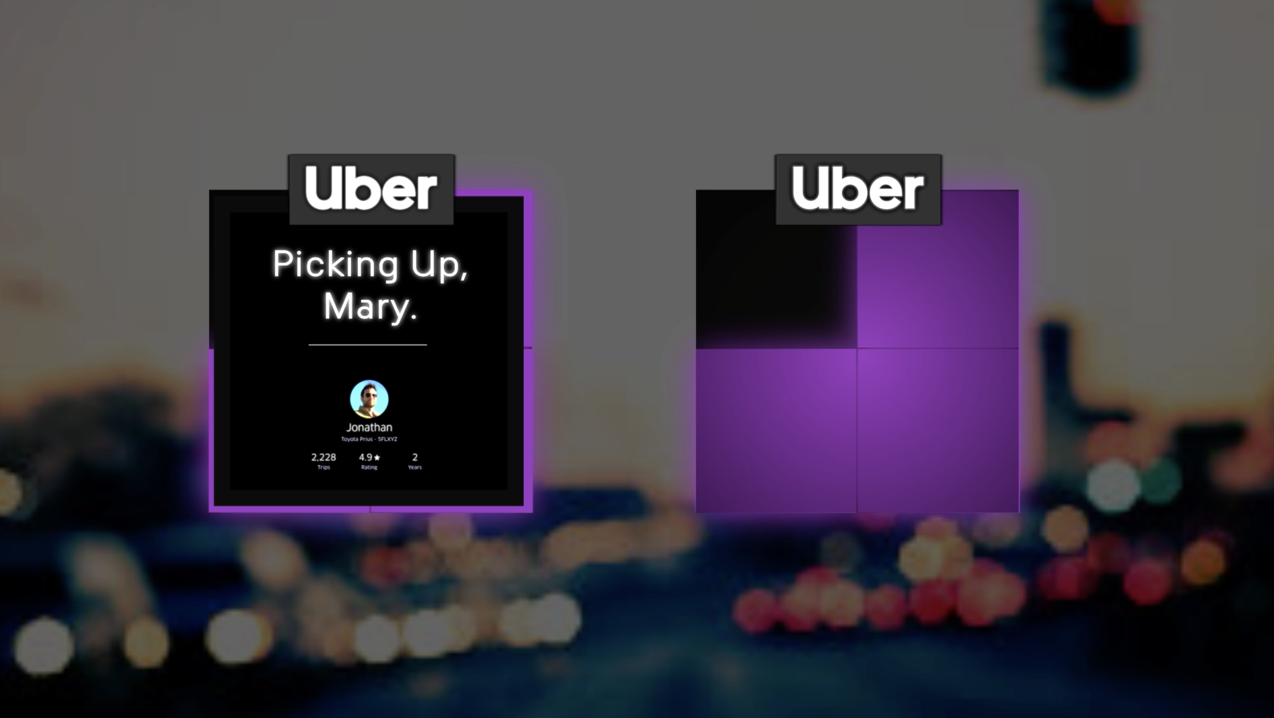
Beacon is Uber’s magnetic dashboard-mounted visual communication device that helps drivers and riders find each other faster and more reliably. It’s sensor technologies provide more accurate pickup and dropoff coordinates. The light’s color can be customized on the app or flash for colorblind users. The back of Beacon features an LED matrix display that faces riders and gives safety tips like “wear your seatbelt.” Beacon truly streamlines the rideshare experience. View here
Role:
UX Research/Interaction design
Team Members:
Dan Harden Creative Director -Whipsaw, Elliot Ortiz Creative Lead - Whipsaw, Britt Jensen Project Manager/Strategist -Whipsaw, PCH Engineering Agency

How did Uber drivers use the Beacon 1.0?
I was permitted by Uber to become a driver with my daily commuter car. The goal of this research was to understand the Uber experience through the eyes of a driver and was used specifically for Whipsaw internal team onboarding. Observations and questions asked during this research session:
Communication between rider and driver
Overall onboarding process of beacon
Pain points for pick up and drop off
Navigation and traffic
In car accessories and usability
Rider comments (if any)
Rider reactions and emotions
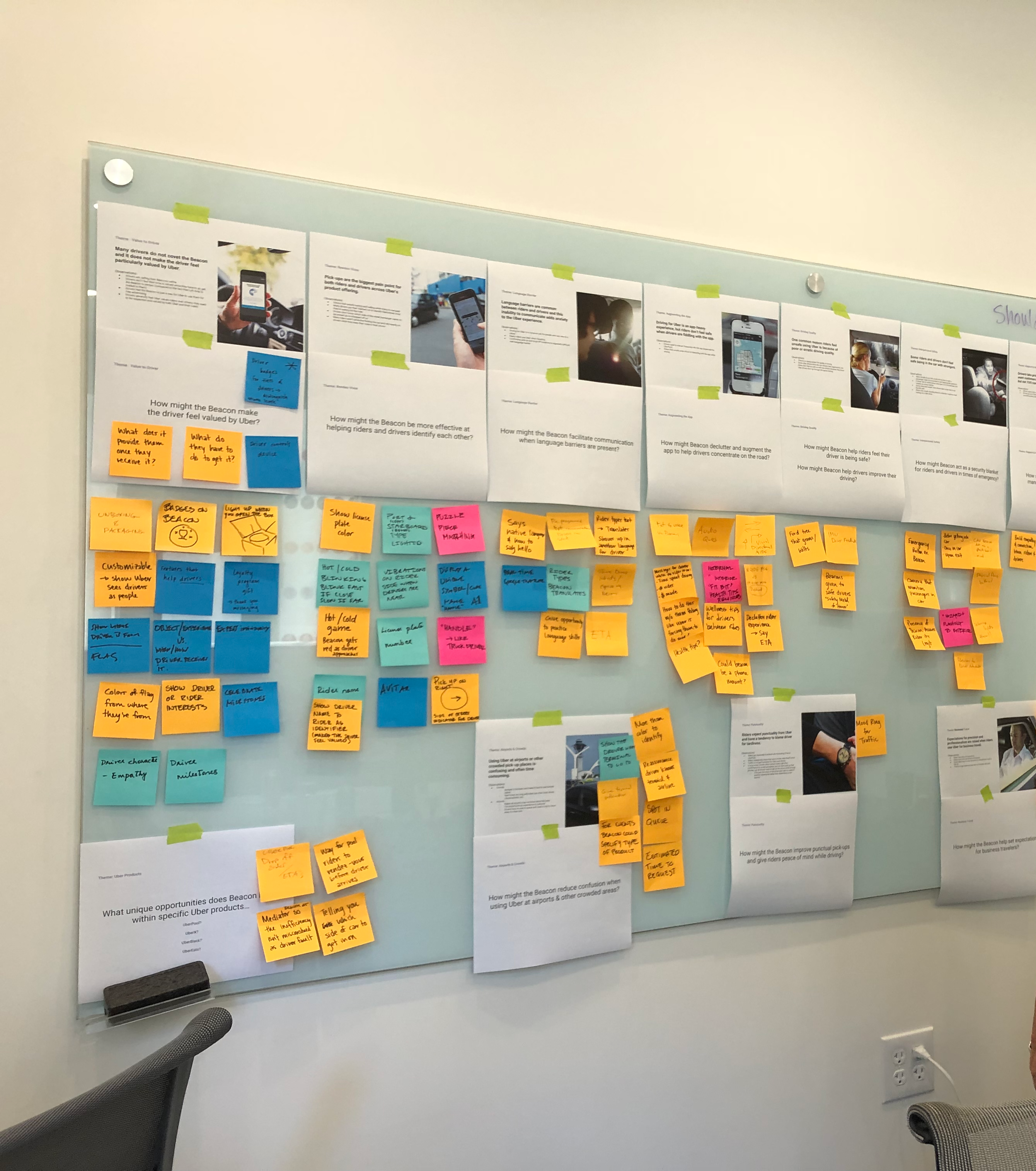
Key takeaways from research:
The Beacon integration with Uber app is frustrating (settings and battery life are buried in app)
The onboarding experience is long and cumbersome
The Beacon’s current placement makes it difficult to route charging cable
The Beacon’s light is not bright enough to be useful during the day
The current placement of the Beacon with other stickers creates a blind spot
Drivers don’t like that they have to move stickers to install Beacon
Riders can only change color
The beacon didn’t provide enough value for the users
Riders want to know where they are going and who they are going with
Design exploration:
In collaboration with the ID team I worked on animations in after affects to help people visualize pickup scenarios on a few ID concept renderings.
Design direction:
The concept that Uber chose a the best design direction was a rectangular shape that had similar proportions to the Uber frame logo designed in 2018 as part of their rebranding launch.

Interface Refinement: Matrix Display
The next step in interface development was to figure out how the matrix would look at full scale with different matrix LED shapes by trying hexagons, circles, and various polygons. The chosen direction was a more traditional square pixel shape, it is the most readable from far away and has flexibility when playing around with space in-between and around the pixels.

Interface Refinement: Font Study
Uber has a specially designed font used in all branding materials, we wanted to visualize how that font looked at different height scales and upper and lowercase styles. In addition to testing out matrix heights, we also explored front logo sizes, each of these tests would help us determine the exact proportion we needed to display the correct amount of information on the device. To keep the costs low for the physical device there were several variables we didn’t change for this test:
Physical pixel/LED size had to be 2 mm (minimum cost effective size)
Matrix has to fit two lines of text


Testing Matrix display designs in dashboards.


