The Project
Tuktuk Rental is a socially responsible vehicle rental company based in Sri Lanka. Over 70% of tuk-tuks in Sri Lanka are owned by low-income Sri Lankans. Tuktuk rental sources and leases these vehicles from locals which helps tuktuk owners earn passive income. In September 2019 I traveled to Sri Lanka to research and improve the onboarding and driving experience of tourists who come to Sri Lanka and rent one of these vehicles.
The Outcome
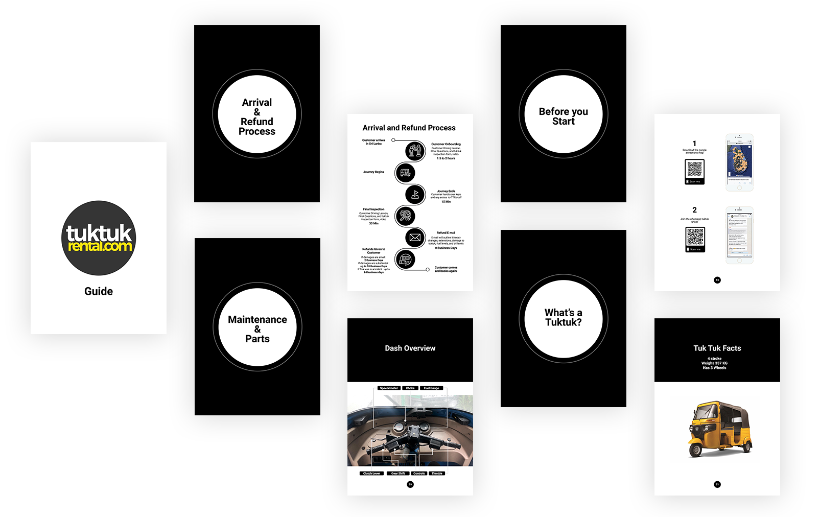
Over the course of 6 weeks I created a new driving manual paired with an interactive QR code system and in-dash prompts to help tourists have fun but also be safe
Role: UX Designer (Contract 6 weeks)
Project Plan
Research
The first step was to deep dive into the customer’s journey this included everything from booking online, onboarding, driving on the road without assistance, dropping off a tuk-tuk, and understanding the returns/refunds process. I conducted 20+ ride-along sessions with customers, conducted 8 staff interviews, observed 10 driving lessons, and constructed a clickthrough analysis and website audit.
Synthesizing Research
A journey map was created to summarize the research findings and to find customer opportunities/ pain point areas.
Full colored journey map
Problem 1: The Handbook
When a customer arrived in Sri Lanka they either picked up a tuktuk in an offsite location or picked the tuktuk up in Colombo. If they went into the office they were given an extensive and detailed orientation which included an overview of the handbook, a video, and help with itinerary. If they didn’t pick up in the main office they were given almost no orientation due to the driving instructor’s language barriers and the only kind of reference was with the handbook.
Too much text
No clear sections or table of contents
Missing key information such as what to do in emergencies and breakdowns
Listed hyperlinks and URL codes that made it impossible to access important online forms, maps, and Sri Lankan government sites.
Old handbook given to customers
Solution: Updated handbook
Bold graphic, clear iconography, organized by sections, updated information.
Problem 2: Information Access
Customers constantly call the staff about all kinds of issues such as how to reach insurance companies, how to find the corrupt police hotline, how to do a booking change, how to book train transfers and other miscellaneous things that were not listed in the manual (if they were listed in the manual it was through a printed hyperlink that the customer had to type into their mobile browser). During business hours office staff could help with customer service, but after hours it was a problem when staff didn’t answer the customer was left feeling left out in the dark.
Solution: QR Quick References
Important information and forms can now be found throughout the manual using a smartphone camera QR code reader.
Problem 3: No Best Practices
Once on the road, the customer who did not read the manual was 50% more likely to have issues such as accidents and breakdowns with their tuk-tuk. Road hazards, wildlife, and lack of experience only made these issues worse. There was nothing in the manual explains how to take care of a tuktuk/ troubleshoot and what to do in the case of an accident. Customers who got into these altercations were more likely to call and complain and would give tuktuk rental a bad review.
Solution: Friendly Reminders and Visual Cues
Other notable project deliverables
Team building
The journey map was not just used as a method of organizing and defining opportunities for the customer. It was also used as a tool for creative thinking and problem-solving tool for the staff. Many of them were surprised at how they could contribute and come up with creative solutions for common customer problems.
Mobile Improvements
The website was overall very user-friendly except for two key tasks booking a tuktuk and filling out a license form. 90% of customers use a smartphone to browse the website but out of that percentage 60% had to complete the tasks on a desktop platform. Upon further investigation, it was discovered that the website was not formatting well when displayed on a mobile platform.


